Geography
and Map Skills
Objectives
![]() Understand the purpose and
uses of globes and map projections. (7.5)
Understand the purpose and
uses of globes and map projections. (7.5)
![]() Describe the parts of a map and the different types of maps geographers
use. (7.5)
Describe the parts of a map and the different types of maps geographers
use. (7.5)
![]() Demonstrate how to read graphs, charts, and diagrams. (7.5)
Demonstrate how to read graphs, charts, and diagrams. (7.5)
Chapter
Overview
A globe is the most accurate map projection; however, it is hard to carry
a globe around in your pocket. Maps help to project the earth in an easier
to manage form, but since the earth is considered a sphere a flat map always
distorts the surface of the earth it is showing. If you take the whole
peel from an orange and try to flatten it on a table you would have to
cut parts of it to stretch it. Mapmaker's face a similar problem showing
the
round earth on a flat map. The different ways they have found to do this
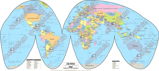
are called projections. The are several map projections.
Goode's Interrupted
Projection: equal-area projection. Quite accurately presents the size and
shape of the continents. Used to compare continent statistics according
to area.
Mercator Projection: created by Gerardus Mercator in 1569. Shows
land shapes fairly accurately, but not distance or size. Areas distant
from
the equator
are
distorted. The Mercator projection does show true directions, making it
very useful for sea travel.
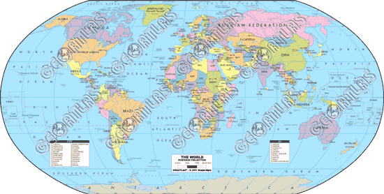
Robinson Projection: shows both size and shape of oceans and continents
quite accurately. Most distorted near the poles. Textbook and atlas maps
are often Robinson projections.
Since a globe is the most accurate way to represent the earth, geographers
set up a system of imaginary lines that crisscross the globe. One line,
the Equator, circles the middle of the earth like a belt. It divides the
earth into "half spheres" or hemispheres. Everything north of the Equator
is the Northern Hemisphere and everything south is the Southern Hemisphere.
Another imaginary line running from north to south divides the earth into
half spheres in the other direction. This line is called the Prime Meridian,
located at 0 degrees longitude. Everything east of the Prime Meridian is
in the Eastern Hemisphere and everything to the west is in the Western
Hemisphere. North America is in the Northern and Western Hemispheres.
The
equator and Prime Meridian are the starting points for two sets of lines
used to find any location. Parallels circle the earth and show latitude,
which is distance measured in degrees north and south of the Equator at
0° degrees latitude. The letter N or S follows the degree symbol and tells
you if the location is north or south of the equator. The North Pole is
at 90° degrees North latitude, and the South Pole is at 90° degrees South
latitude. The Tropic of Cancer is at 23 1/2°N latitude and the
Tropic of Capricorn at 23 1/2°S latitude. The Arctic Circle is at 66
1/2°N latitude and the Antarctic Circle at 66 1/2°S latitude. Meridians
run north and south from pole to pole. These lines signify longitude which
is distance measured in degrees east or west of the Prime Meridian at 0°
degrees longitude. The letter E or W follows the degree symbol and tells
if the location is east or west of the Prime Meridian. On the opposite
side of the earth is the International Date Line, or the 180°
meridian. Lines of latitude and longitude cross each other in the form
of a grid system. Knowing a place's latitude and longitude allows you to
locate it exactly on a map (absolute location).
A great circle is the shortest distance between two points on earth. A
great circle is any circle you can draw on the earth that divides it into
two equal parts. A line drawn along the Equator around the entire earth
is an example of a great circle. Traveling along a great circle is called
following a great circle route. Airplane pilots and ship captains often
use great circle routes to shorten their trips and cut down on fuel needed.
The great circle route between two points may not appear to be the shortest
distance on a flat map.
The map key unlocks the information presented on a map. It explains the
symbols used on a map. A compass rose is the direction marker on a map.
The compass rose generally includes the cardinal directions: north, south,
east, and west. It can also include intermediate directions that fall between
cardinal directions. The measuring line on a map is the scale bar. The
scale tells you the distance on the earth represented by the measurement
on the scale bar. For example, one inch on a map may represent 100 miles
on earth. There are many different kinds of maps. Maps that show a wide
range of general information are called general purpose maps. Political
maps generally show political or human-made divisions of countries or regions.
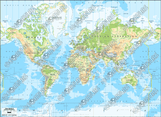
Physical maps show the physical features of and are, like mountains and
rivers. Physical maps use colors and shadings to show relief (how flat
or rugged the land surface is). Colors may also be used to show elevation.
Contour maps show elevation. A contour map has contour lines, one for each
major
level
of
elevation.
If contour
lines
are close
together,
the surface is steep. If the lines are far apart, the land is flat or rises
gradually. Another way to show relief is to look at the landscape from
the side, or profile. The elevation profile is a cutaway diagram that show
level land, hills, and steeper mountains. Special purpose maps include
land use and resource maps, geological maps, population density maps, and
climate region maps.
Graphs are important in geography (GEOGRAPHY USES MATH!!!). Graphs summarize
and give information visually and give useful information. To use a graph
you
first
read the
title to see what is the graph's subject. Then read the labels along the
graph's axes (the vertical and horizontal lines along the bottom and sides
of the graph). One axis tells what is being measured and the other tells
what units of measurement are being used. Kinds of graphs include bar graphs
(used to compare quantities), line graphs (good for showing change over
time), circle graphs (or pie graph - used to show how the whole of something
is divided), pictographs (uses pictures or symbols to compare something),
and climographs (climate graph - combines a line graph and a bar graph
and gives an overall picture of the climate - long-term weather patterns).
Diagrams are also used in geography. Diagrams are drawings that show steps
in a process, or explain how something works. A flow chart is a diagram
that combines elements of a diagram and a chart. Charts and tables present
organized facts and statistics so they are easier to read.
1999-2006 © Hokanson's Social Studies